Chat Check
@ Wellesley HCI
Role/Team
Myself (Lead UI/UX Designer)
Sarah (UI/UX Designer and Scribe)
Maddie (UI/UX Designer)
Myself (Lead UI/UX Designer)
Sarah (UI/UX Designer and Scribe)
Maddie (UI/UX Designer)
Tools
Figma, Balsamiq, UserTesting
Figma, Balsamiq, UserTesting
Duration
4 weeks, 2021
4 weeks, 2021
Project Overview
ChatCheck is an app that makes it easy for friends and family to keep each other informed with the most credible information while texting and calling. Unlike our competitors, this messaging app includes a credibility checking feature directly in its messaging system while still maintaining user privacy with end to end encryption.
This group project was part of the accelerated 4 week Human Computer Interaction course at Wellesely College in Spring 2021
The Problem
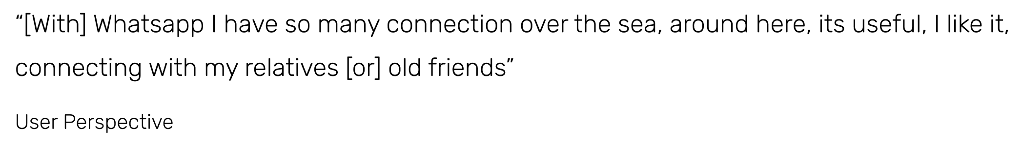
Many users that utilize 3rd party messaging applications to communicate with love ones abroad, fall victim to fake news conspiracy theories. Heightened hysteria during the pandemic has made these applications, like Whatsapp, a breading ground for misinformation particularly surrounding politically relevant events and products. The spread of fake news through messaging applications is especially insidious because users tend to have more trust in the source of the information in the context of one on one communication. Users are more likely to trust misinformation when it is being forwarded from a loved one or an otherwise trustworthy person.
Preliminary Interviews
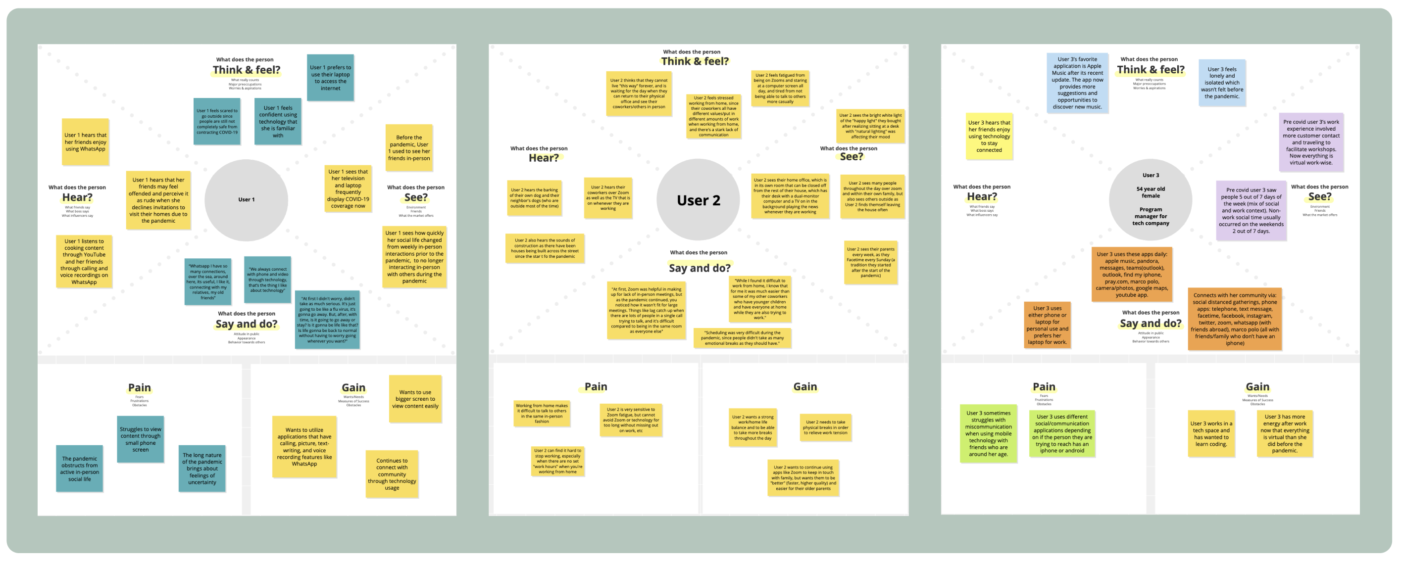
Idenitfying the Target MarketAfter choosing our target population of people ages 40 to 60, we conducted discussion based interviews with 3 people who fit the criteria. These conversations loosely followed a predetermined list of questions geared towards understanding their experiences and feelings related to the pandemic and technology use. From these interviews we constructed empathy maps to visualize what the users think, feel, say, and do.
Hierachical Task Analysis
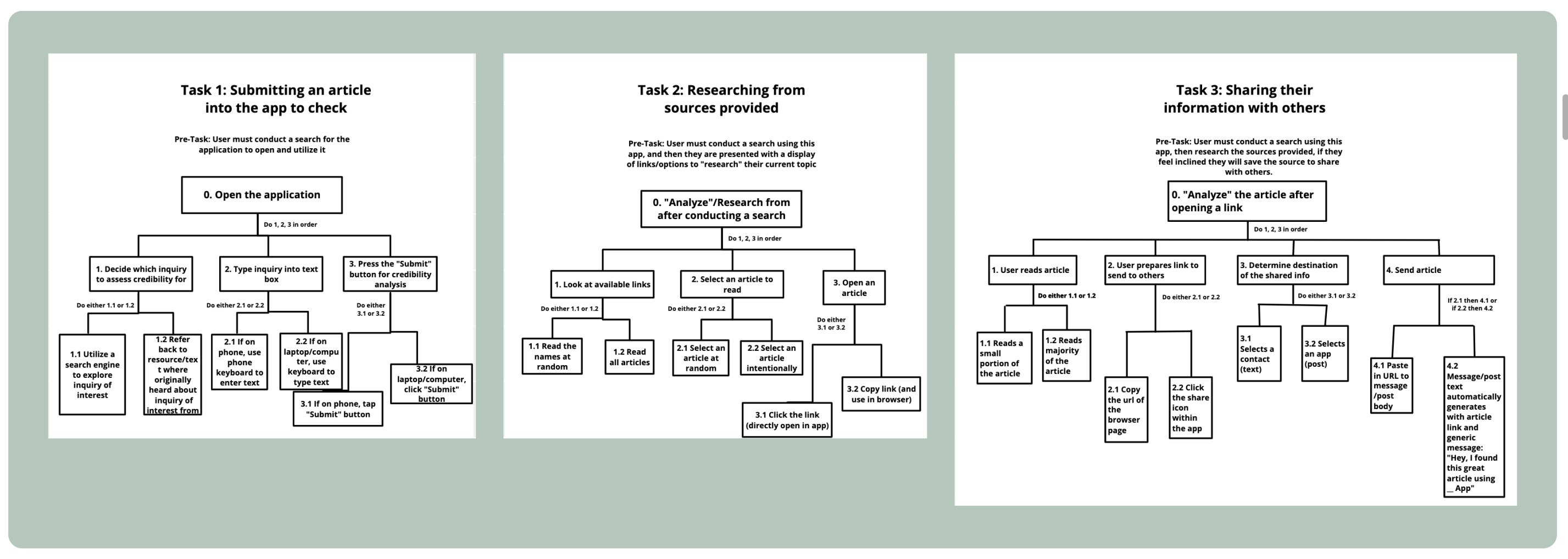
Brainstorning the User JourneyAt this phase of development, our team decided to focus on helping users identify "fake news" when using the internet in general. We identified 3 high level tasks within the problem domain: submitting an article into the app to check its credibility, researching the credible sources provided, and sharing this information with others. Through mapping out the user's steps, we were able to simplify their journey and help them reach the goals of the product more efficiently.
User Personas
Centering the User at Every PhaseTo uphold the goal of centering the user in our designs, we created engaging user personas. These user personas helped our team consider our target users at every step. The two personas we created were heavily informed by the early on user interviews and embodied the diverse experiences across our target age group.

Preliminary UI Design
Before prototyping our software product, we drew out very low fidelity ideas of the main screens of our application. Rather than focusing on the visual design aspect, this exercise allowed us to hone in on the main content and control elements of the interface. Through a collaborative brainstorming session, we identified two different design approaches for our app landing page: a minimal search engine-like design and a trending page approach.
The minimalist approach has a design consistent with other commonly used search engines which adds a potential level of familiarity for new users since there are no immediate instructions for how to use the app. Additionally, the user can efficiently make a unique search since the input field is the main element on the landing page.
The trending design includes more visual content than the previous option but if the user does not have a unique search in mind, they are able to browse the list of trending queries automatically provided on the landing page.

Lo-Fi Prototyping
Once reaching the prototyping phase of our project, our team had to choose a concrete direction for our product. We identified "risky" aspects of our concept and decided to create a 3rd party messaging app that includes a credibility verification feature instead of a search engine-like product that lacked uniqueness from other existing products.
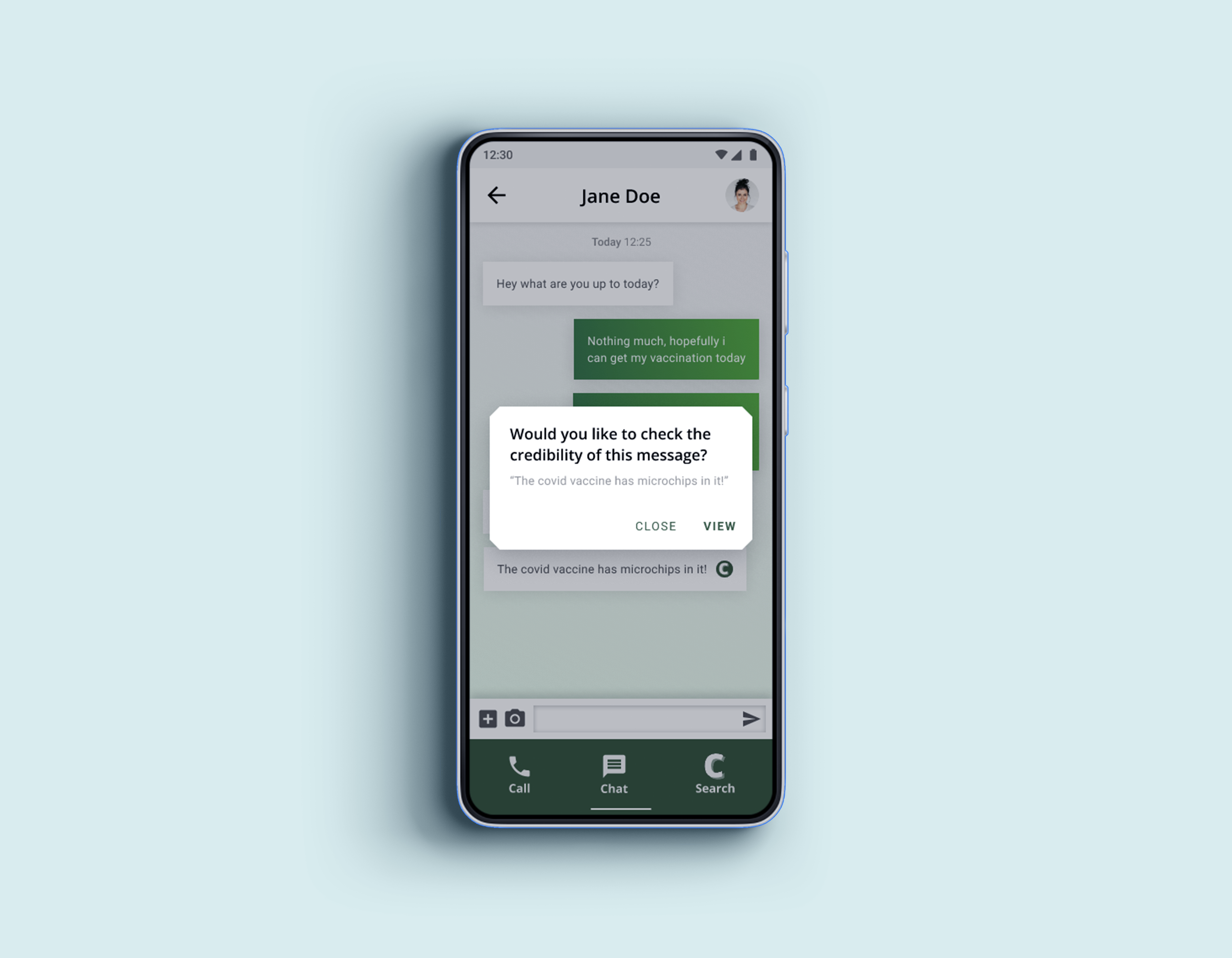
Using Balsamiq, we created a low fidelity paper-like prototype of our messaging app that could be used to conduct pilot user-testing. This wireframe included the onboarding process, the credibility checking page to make a unique search, messaging with a conversation that included misinformation, the credibility alert and corresponding page with credible sources, and the capability to share this newfound information directly to the same conversation.
User Testing
To prepare for testing we created a briefing for users that included the scenario of use for the product and 3 main tasks for them to complete. Our scenario was, "Imagine you are an adult trying to communicate with your family who takes a lot of information they hear at face-value."
Without providing specific instructions to the user we identified these tasks:
- “explain in your own words how you would use this mobile app to check the credibility on the statement ‘the 2020 elections were a fraud’”
- “explain in your own words how you would use this mobile app to check the credibility of something you just texted your friend, such as “the Covid-19 vaccines has microchips in it”
- “explain in your own words how you would use this mobile app to share with your friend via text whether or not ‘the 2020 elections were a fraud’”
After conducting the test, users were then asked to pos-task questions:
- What did you like about this app?
- If you were to use this app, do you see yourself using the credibility checking feature?
- How do you feel about the presentation of information from the credibility checker?
The results of the pilot testing were limited. All 3 of the users that tested were above the age of 40 and had varying levels of technological experience. None of the users were able to complete the tasks and were confused on how to interact with the low-fidelity prototype, none of them made it past the onboarding pages. One main take-away from this stage was the need for familiar design and clear instructions for how the elements should be interacted with.
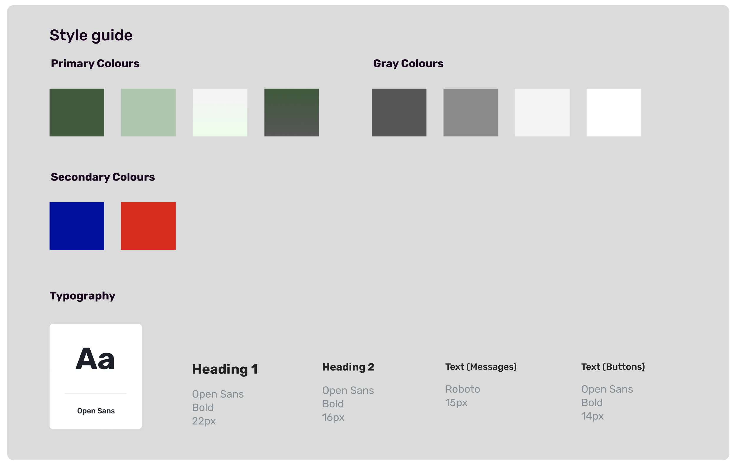
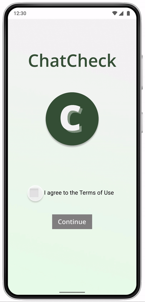
Branding
Before further designing our prototype, the team discussed our application's "brand identity" to hone in on the tone and visual aspects of the design. To practice Material Design principles and align with our target audience of immigrant communities and users abroad, we created the app on an android interface.
Color Scheme
- Minimal color scheme to not distract new users from the key elements
- Grayscale, two tones of green as accent colors and a bright red color for elements that require high contrast to draw attention
- Messaging apps like Line, WeChat, and WhatsApp all use a green as their primary color
- Establish trust and reliability while also ensuring our app was familiar
Iconography/Typography
- Logo/credibility icon: the green double C which stands for "ChatCheck"
- Android-oriented Material Design standards
Final Prototype
Live prototype in figma (clickable)
Gif of prototype
Reflections and Next Steps
From UserTesting.com, we realized how important it was to provide as much information as we could beforehand, since users experience a wide range of prototypes to test. This was a huge insight into how to conduct testing on this platform in the future.
Considerations for future iderations
- We are unsure if this app will attract users who are drawn to misinformation and if they value fact-checking, more research and testing is needed.
- Explore the privacy or surveillance concerns from scanning users messages.
Ellis Aguilar 2026